Tired of playing it safe with beige? Choosing the right palette can feel overwhelming, which is why so many homes settle for neutral—but uninspired—color schemes. This guide explores the most impactful and livable modern interior color trends shaping homes right now. We’ll break down four dominant palettes, uncover the psychology behind why they work, and share practical tips to help you use them confidently in your own space. Whether you’re refreshing one room or reimagining your entire home, you’ll leave with clear direction and the inspiration you need to craft a space that truly reflects your style.
The Earthy Embrace: Why Warm Neutrals Are Replacing Cool Grays
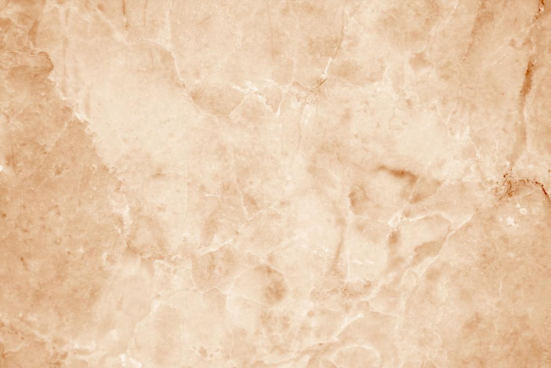
For years, cool gray ruled interiors. It felt sleek, safe, and unmistakably modern. However, many homeowners began noticing something unexpected: those icy undertones can read sterile (think “luxury waiting room” energy). In response, warm neutrals have stepped in, offering comfort, stability, and a deeper connection to nature.
This shift aligns with modern interior color trends that prioritize emotional well-being. Instead of blue-based grays, designers now reach for mushroom (a soft brown-gray), greige (a balanced gray-beige), warm taupe, terracotta, and creamy off-whites. Each shade carries subtle warmth, making spaces feel grounded rather than stark.
To apply this palette successfully, start with a dominant base—say, warm taupe on the walls. Next, layer in variation: a mushroom-toned sofa, creamy off-white trim, and terracotta accents in pottery or textiles. Then, and this is key, vary texture to avoid flatness. Combine linen drapes, a wool throw, and a clay vase. Texture adds dimension where color contrast is minimal.
Some argue cool grays are more versatile and resale-friendly. Fair point. Yet warm neutrals are just as adaptable—and far more inviting. (Even Nancy Meyers would approve of the glow.)
Pro tip: Test paint samples at different times of day; warm undertones shift beautifully in natural light.
Ultimately, this is about creating a sanctuary—an essential living concept rooted in calm, timeless comfort.
Daring Depths: Using Saturated Colors to Create Intimate Spaces
Deep, saturated colors do more than look dramatic—they reshape how a room feels. According to color psychology research published in Frontiers in Psychology (2020), darker hues can evoke feelings of safety and enclosure, which explains why a charcoal dining room often feels cozier than a stark white one. In other words, moody hues don’t shrink a space emotionally; they wrap it in intention.
The Psychology of Moody Hues
Forest green, deep navy, charcoal, and rich burgundy or plum consistently rank among modern interior color trends. Designers favor them because they absorb light rather than reflect it, softening visual noise (goodbye, glare). A 2023 Houzz survey found that 38% of homeowners renovating living rooms opted for darker feature walls to create warmth and contrast.
Prize-Worthy Design Technique
For a bold move, try color-drenching—painting walls, trim, and even the ceiling the same shade. This technique eliminates visual breaks, making the room feel curated and luxurious. Alternatively, apply one saturated accent wall in a well-lit room for balance. (Think of it as the espresso shot of design—small but powerful.) Pro tip: test large swatches in changing daylight before committing.
Balancing the Dark
To avoid a cavernous effect, pair deep tones with brass or bronze accents, light-colored furniture, and layered lighting. Strategic contrast keeps the mood intentional, not heavy. And if you’re maximizing layout flexibility, explore multi functional furniture ideas for flexible spaces to ensure form supports function.
The New Pastels: Sophisticated Hues with a Muted Soul*
Pastels have grown up. Gone are the sugary pinks and baby blues that once dominated nurseries and Easter displays. Today’s versions are dustier, moodier, and far more refined. Think less cotton candy, more cashmere throw. These evolved shades carry gray or earthy undertones, giving them depth and versatility that feel aligned with modern interior color trends.
The Modern Pastel Palette
Key players include dusty rose, muted lavender, pale apricot, and hazy blue. Each contains a subtle infusion of brown or gray pigment—an intentional formulation detail that softens brightness and prevents visual fatigue. That means you get color without glare (your eyes will thank you).
These hues perform especially well in:
- Bedrooms, where muted lavender promotes relaxation (studies show soft purples can reduce stress responses; see University of Sussex color research).
- Bathrooms, where hazy blue evokes spa-like calm.
- Home offices, where pale apricot encourages gentle creativity without distraction.
Pairing Suggestions
Muted pastels shine when layered with warm neutrals like creamy beige or soft taupe. Add natural oak, walnut, or travertine to ground the palette. The contrast between airy color and organic texture creates balance—polished but never precious.
Some argue bold, saturated shades make a stronger design statement. True, but bold colors demand attention. These pastels invite it. They whisper rather than shout (and sometimes that’s the real luxury).
The result? Spaces that feel current, calm, and quietly confident.
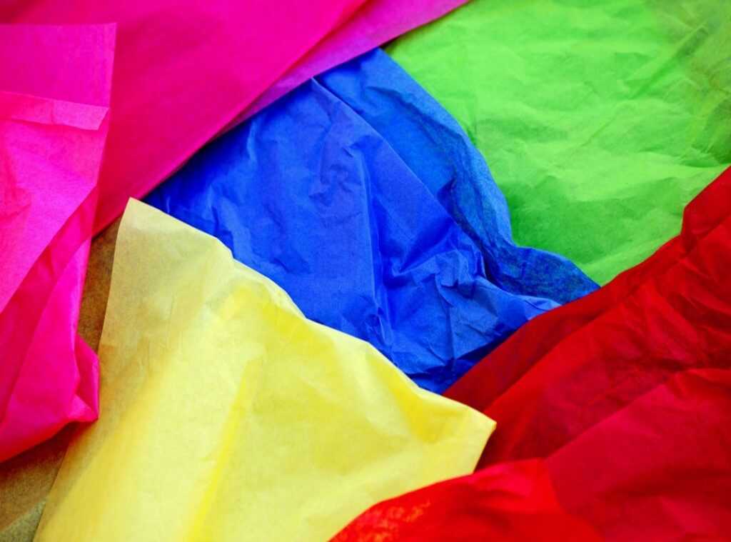
Strategic Color Bursts are the secret sauce of modern interior color trends. “They’re like red lipstick for a room,” a client laughed, “small, but unforgettable.” This approach means using bold hues in tight, intentional doses for maximum impact. Think mustard yellow, burnt orange, cobalt blue, and kelly green—energetic shades that wake up neutrals. As one designer put it, “Color should whisper or shout, never mumble.”
Try:
- A velvet armchair in cobalt blue.
- A single painted interior door in kelly green.
- Vibrant throw pillows on a neutral sofa, or a bold abstract canvas.
Pro tip: repeat the accent once more in a smaller accessory to create rhythm without chaos. The result? Personality, punch, and polish—no renovation required. It’s confidence, bottled in a brilliant hue. Use it wisely.
As we explore the vibrant hues redefining contemporary spaces, it’s fascinating to consider how these choices reflect broader cultural shifts, much like the quirky commentary found in our article ‘Wutawhelp Whatutalkingboutwillis‘.
Design Your Space with Confidence
You came here looking for clarity on modern interior color trends, and now you have a complete toolkit—from grounding earthy neutrals to energizing accent pops. The right palette doesn’t just fill a room; it defines how it feels and the story it tells every day. If you’ve been staring at blank walls unsure where to begin, that uncertainty ends here. Choose the shades that reflect your mood, layer them with intention, and start small if you need to. Ready to love your space again? Explore more trend-forward ideas and practical styling tips now—and transform hesitation into a home that feels uniquely yours.
 Head of Interior Trends & Concepts
Wayne Lewisignest is the kind of writer who genuinely cannot publish something without checking it twice. Maybe three times. They came to hidden gems through years of hands-on work rather than theory, which means the things they writes about — Hidden Gems, Everyday Home Optimization Tips, Essential Living Concepts and Styles, among other areas — are things they has actually tested, questioned, and revised opinions on more than once.
That shows in the work. Wayne's pieces tend to go a level deeper than most. Not in a way that becomes unreadable, but in a way that makes you realize you'd been missing something important. They has a habit of finding the detail that everybody else glosses over and making it the center of the story — which sounds simple, but takes a rare combination of curiosity and patience to pull off consistently. The writing never feels rushed. It feels like someone who sat with the subject long enough to actually understand it.
Outside of specific topics, what Wayne cares about most is whether the reader walks away with something useful. Not impressed. Not entertained. Useful. That's a harder bar to clear than it sounds, and they clears it more often than not — which is why readers tend to remember Wayne's articles long after they've forgotten the headline.
Head of Interior Trends & Concepts
Wayne Lewisignest is the kind of writer who genuinely cannot publish something without checking it twice. Maybe three times. They came to hidden gems through years of hands-on work rather than theory, which means the things they writes about — Hidden Gems, Everyday Home Optimization Tips, Essential Living Concepts and Styles, among other areas — are things they has actually tested, questioned, and revised opinions on more than once.
That shows in the work. Wayne's pieces tend to go a level deeper than most. Not in a way that becomes unreadable, but in a way that makes you realize you'd been missing something important. They has a habit of finding the detail that everybody else glosses over and making it the center of the story — which sounds simple, but takes a rare combination of curiosity and patience to pull off consistently. The writing never feels rushed. It feels like someone who sat with the subject long enough to actually understand it.
Outside of specific topics, what Wayne cares about most is whether the reader walks away with something useful. Not impressed. Not entertained. Useful. That's a harder bar to clear than it sounds, and they clears it more often than not — which is why readers tend to remember Wayne's articles long after they've forgotten the headline.