
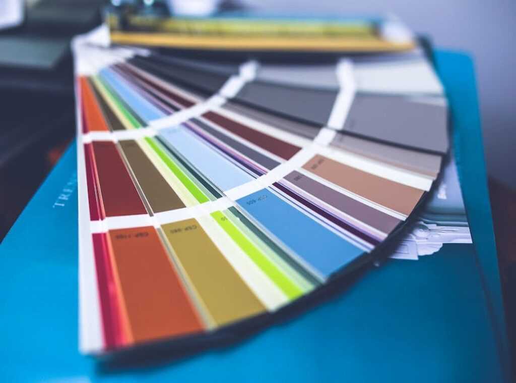
Feeling lost in a sea of paint swatches at the hardware store? You’re not alone. Choosing the right color schemes home can feel overwhelming.
I’m here to change that. This guide will cut through the noise and focus on the essentials. It’s not about chasing trends; it’s about understanding core design principles to create harmony in your space.
Trust me, I’ve got the takeaways you need. We’ll break down the process into manageable steps, transforming it from a constant chore into a rewarding experience. Ready to master your home color palette?
Let’s dive into a world of colors that truly fit your home.
The Fundamentals: Color Theory Simplified for Interiors
Ever feel lost choosing colors for your home? Let me introduce you to the color wheel. It’s the secret sauce for great color schemes. Primary colors (red, blue, yellow) lay the foundation.
Mix them to get secondary colors (green, orange, purple). And it doesn’t stop there. Blend those to find tertiary colors.
Simple, right?
But here’s a game-changer: color temperature. Warm colors (think reds and oranges) create a cozy vibe. Imagine a snug living room.
On the flip side, cool colors (blues and greens) offer a refreshing atmosphere (perfect) for a crisp bathroom. It’s all about the mood you want to set.
Now, let’s dig into the designer’s secret weapon: the ‘60-30-10 Rule’. This is key for balance. Picture your walls taking up 60% of the color (dominant color).
Furniture follows with 30% (secondary), and decor or accents wrap it up with 10%. It’s a foolproof formula. Trust me.
Undertones are sneaky little devils. A neutral gray isn’t just gray. It might lean blue or green, and that can trip you up.
Here’s a tip: compare swatches side by side. It reveals those hidden undertones so they don’t clash.
Want to transform living room minimal effort? Start with these principles. They’re not just rules; they’re the backbone of successful color schemes home.
Now, go rethink your space.
Find Your Color Story: Uncover What You Love
Forget the endless theory. It’s about what you love. Your personal color story starts with you.
First, let’s “Shop Your Closet.” Look at what you wear most. Those are colors you naturally gravitate towards. Clothes can reveal more about your preferences than you think.
Why? Because you’ve already chosen them (sometimes subconsciously). Ever notice a color you wear more when you’re in a good mood?
That’s telling.
Next, find your “Anchor Piece.” It could be an artwork or a favorite rug. Something that catches your eye every day. This is a great starting point for your palette.
Let’s not forget nature. Take a walk or look at travel photos. A beach, forest, or desert can offer endless inspiration.
It’s already a part of your home, so why not build around it? A room can feel more cohesive when it reflects what you actually love. No need to force trends that don’t connect with you.
Nature’s colors often feel balanced and calming. I once used the subtle shades of a sunset as a guide. The result?
A room that felt warm and inviting. Here’s a pro tip: Keep a small notebook or use your phone to jot down any color combos you see outdoors.
Now, gather your ideas. Create a mood board. Pinterest is great for digital boards (I use it all the time), but old-school clippings work too.
This helps refine your vision into something tangible. And hey, if you’re curious about crafting building colour schemes, there’s a wealth of resources out there.
This isn’t just about paint on walls. It’s about creating a space that feels like you. Your color schemes home should be a reflection of your style, not someone else’s.
So, start with what you know and expand from there. Your personal color story is waiting to be discovered.
Inspiration in Action: Timeless Home Color Palettes
Choosing the right color schemes for your home can be daunting. But it doesn’t have to be. to four classic palettes that never go out of style. These will help you define the mood and personality of your space.

First up, the Serene Monochromatic. Imagine using tints, tones, and shades of a single color like blue. This palette is all about calm sophistication.
The trick is in the texture. Mix up materials. Think soft fabrics with sleek metals (to) keep it interesting.
It’s perfect for minimalistic homes that want a touch of elegance without the clutter. Who doesn’t love a bit of tranquility?
Next, we have the Grounded Earthy Neutrals. This palette of warm greys, beiges, terracotta, and olive green brings comfort and warmth. It’s like wrapping your home in a cozy blanket.
Earthy tones are welcoming and organic. They suit rustic and modern settings equally. If you want a home that feels inviting and lived-in, this is your go-to.
Now, let’s shake things up with the High-Contrast Dramatic palette. Picture navy blue paired with burnt orange. This approach creates energy and draws the eye.
It’s bold and not for the faint-hearted. But it works wonders in making focal points stand out. A dramatic color scheme can totally transform an ordinary room into a conversation starter.
Finally, the Coastal Cool. Think soft whites, sandy beiges, and various shades of blue and seafoam green. This palette breathes fresh air into any space.
It conjures images of laid-back beach days with its relaxed and open feel. Ideal for homes near the coast or for those who just want to bring the beach inside. It’s a fresh take on making your home feel spacious and breezy.
Feeling inspired to try these color schemes at home? If you’re working with a small space, this guide might help you learn more about crafting cozy spaces. It’s all about creating the right atmosphere.
Remember, colors do more than paint your walls. They set the mood and define your style. Each palette offers a unique vibe, transforming any house into a home that feels authentically yours.
Choose wisely and let your home reflect who you are.
From Concept to Reality: Making Colors Work
Choosing colors for your home is one thing, but making them work in real life? That’s the real challenge. Testing colors in the actual space is key.
Forget those tiny swatches. They lie. Instead, paint a large poster board and move it around the room.
You’ll see how light plays tricks on color throughout the day. Ever notice how a color can look completely different in the morning versus at night? Yeah, that’s what we’re dealing with.
Don’t overlook the paint finish. Matte, eggshell, satin. Each changes the look and feel of your color.
Matte can make a room feel cozy, while satin gives a touch of elegance.
And for creating flow between rooms, use a unified trim color or carry one accent color from your main palette into adjacent spaces. It ties everything together. So, what’s your color scheme story?
Because your home deserves it.
Transform Your Space with Confidence
Choosing color schemes home isn’t rocket science. It’s about understanding basics and tapping into your own style. Trust me, anyone can do it.
You now have the tools to make designer-worthy choices without breaking a sweat. So, what’s holding you back? Your perfect home awaits.
Start small. Pick a room. Create a mood board.
Watch as your vision unfolds. It’s time to stop dreaming and start painting. Need help?
Visit livpristhouse.com for inspiration and tips. They’ve got the takeaways to make your next project a success. Take the first step today.
You’re ready.
 Founder & Creative Director
Kylor Dornhaven is the kind of writer who genuinely cannot publish something without checking it twice. Maybe three times. They came to home inspiration headlines through years of hands-on work rather than theory, which means the things they writes about — Home Inspiration Headlines, Interior Trends and Layout Ideas, Essential Living Concepts and Styles, among other areas — are things they has actually tested, questioned, and revised opinions on more than once.
That shows in the work. Kylor's pieces tend to go a level deeper than most. Not in a way that becomes unreadable, but in a way that makes you realize you'd been missing something important. They has a habit of finding the detail that everybody else glosses over and making it the center of the story — which sounds simple, but takes a rare combination of curiosity and patience to pull off consistently. The writing never feels rushed. It feels like someone who sat with the subject long enough to actually understand it.
Outside of specific topics, what Kylor cares about most is whether the reader walks away with something useful. Not impressed. Not entertained. Useful. That's a harder bar to clear than it sounds, and they clears it more often than not — which is why readers tend to remember Kylor's articles long after they've forgotten the headline.
Founder & Creative Director
Kylor Dornhaven is the kind of writer who genuinely cannot publish something without checking it twice. Maybe three times. They came to home inspiration headlines through years of hands-on work rather than theory, which means the things they writes about — Home Inspiration Headlines, Interior Trends and Layout Ideas, Essential Living Concepts and Styles, among other areas — are things they has actually tested, questioned, and revised opinions on more than once.
That shows in the work. Kylor's pieces tend to go a level deeper than most. Not in a way that becomes unreadable, but in a way that makes you realize you'd been missing something important. They has a habit of finding the detail that everybody else glosses over and making it the center of the story — which sounds simple, but takes a rare combination of curiosity and patience to pull off consistently. The writing never feels rushed. It feels like someone who sat with the subject long enough to actually understand it.
Outside of specific topics, what Kylor cares about most is whether the reader walks away with something useful. Not impressed. Not entertained. Useful. That's a harder bar to clear than it sounds, and they clears it more often than not — which is why readers tend to remember Kylor's articles long after they've forgotten the headline.