Ever walked into a room and instantly felt at ease? You know, where everything seems to click, and you can’t quite put your finger on why. Then there’s the opposite: spaces that scream chaos, leaving you unsettled.
It’s frustrating, right? We all crave that harmonious vibe, but how do you achieve it without a designer’s budget?
Here’s the secret: symmetry balance design. It’s not just about pricey items or trendy furniture. It’s about using what you have in a thoughtful way.
I’ve analyzed countless prize-worthy interiors, and guess what? They share simple, repeatable elements.
This article is your guide to unlocking that magic. You’ll discover core principles, learn actionable steps, and finally master the art of creating a space that just feels right. Trust me, it’s easier than you think.
The Foundation: Understanding Harmony in Design
Harmony is the ultimate goal of interior design. It’s where everything comes together to create a unified message. It’s like watching a movie where every actor and scene plays a role in telling the story. Unity is the anchor here.
It’s that feeling that everything belongs together. A consistent color palette, a defined style (like mid-century modern), or a recurring theme can achieve this.
You might think, “Why not just stop there?” Because a room with perfect unity can feel, well, boring. Enter variety. This is where contrast shakes things up, adding interest that breathes life into the space.
Think about introducing a bold accent color or mixing textures. A smooth leather chair paired with a chunky knit throw, or a unique piece of art, can work wonders.
But let’s not forget the emphasis. The star of the show. Every harmonious room needs a focal point that draws the eye and anchors the space.
Maybe it’s a fireplace, a large window with a view, or a statement headboard. This is what makes the room memorable.
Of course, achieving harmony in design is not just about picking colors or styles. It’s about layering elements effectively. Speaking of which, if you’re looking to dive deeper into this concept, check out Mastering Art Layered Lighting.
It’s a game changer.
So, is symmetry balance design really that important? Absolutely. When you get it right, it transforms a space from just another room to a cohesive masterpiece.
Balance and Scale: The Art of Visual Weight
When you’re arranging a room, it’s not just about shoving furniture against walls and calling it a day. Visual weight matters. You know that feeling when a room just feels right?
That’s balance. And there’s a method to it.
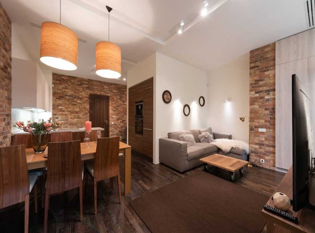
Let’s start with symmetrical balance. Picture a living room where a sofa sits with identical end tables and lamps on either side. It’s like looking in the mirror.
This kind of setup creates a sense of calm and order. But what if you want more energy in your space? Enter asymmetrical balance.
Asymmetrical balance is the cool younger sibling. It’s modern and changing. Imagine a hefty sofa on one side of the room.
You can balance it with two smaller armchairs and a floor lamp on the other. It feels balanced without being cookie-cutter.
Here’s the secret sauce: visual weight. Dark colors, complex patterns, and big pieces are heavy. Light colors, simple patterns, and smaller sizes feel lighter.
Mastering this is key to getting asymmetry right.
Scale and proportion are tricky. Use furniture that’s the right size for your room. Don’t cram a giant couch in a tiny space.
A good rule of thumb? Keep at least 18 inches between a coffee table and sofa. And make sure there’s a clear 3-foot path for walking.
If you’re curious about digging deeper into these concepts, check out this in-depth look. It’s worth understanding how symmetry, balance, and design tie together in a room.
Rhythm and Repetition: Guide Your Eye
Rhythm in a room is like music for your eyes. It’s the invisible path your gaze follows (even if you don’t notice it). A good rhythm makes a space feel intentional and connected.

It’s got to flow, otherwise, well, it’s like a bad song you can’t escape.
Repetition is the easiest way to create this rhythm. It’s about repeating a color, pattern, shape, or texture. Think of it as the chorus in your favorite track.
For instance, you can tie a room together by using the same shade of green in throw pillows, a vase, and a piece of wall art. Simple, right?
Then there’s progression. This isn’t just about lining things up (it’s) an art. Arrange elements in sequence, like from small to large or light to dark.
Picture a cluster of three candles of varying heights on a mantelpiece. Or a gallery wall where frames gradually increase in size. It’s all about that smooth transition.
Speaking of transitions, they steer your eye from one point to another. A curved sofa or an arched doorway can act as transitional elements. Even the pattern of a rug can create a graceful flow.
These elements make sure your eye doesn’t jump around like a caffeinated squirrel.
Pro tip: Stand at the doorway of your room and notice where your eye goes first, second, and third. If it feels jarring, add repetitive or transitional elements to smooth the journey. Need more ideas?
Check out this guide for making bold statements with accent walls. Embrace symmetry balance design, and your room will sing.
The Unifying Power of Color and Texture
Let’s talk about one of the biggest headaches in design: choosing colors. It’s like picking a favorite kid (if you’ve got a bunch). There’s a trick, though.
I swear by the 60-30-10 rule. It’s a lifesaver for a balanced color palette. Here’s the deal: 60% of your room should be a dominant color.
Think walls. Then, 30% for a secondary color. This could be furniture or curtains.
Finally, 10% for that pop of accent color. You know, pillows or decor.
Imagine a living room. You’ve got soft gray covering 60%. Navy blue takes up 30%.
And mustard yellow? It sneaks in with 10%. Bam!
Symmetry balance design achieved.
But color isn’t the whole story. Texture plays a huge role. You don’t want a room feeling flat or sterile.
Harmony isn’t just visual; it’s tactile. Here’s where texture pairings shine. Think smooth silk paired with rough linen.
Or soft velvet with hard metal. Even glossy surfaces with matte finishes. These combos bring depth.
Pro tip: mix up textures to make your space feel rich and curated. You wouldn’t wear an outfit all in one fabric, right? Same goes for your room.
The blend of textures is what separates the amateurs from the pros.
Ever sat in a room that feels like a catalog page? Yeah, that’s what happens when you skip texture. No one wants that.
So next time you’re designing, think beyond just colors. Mix those textures. Your room will thank you.
Harmonize Your Space Effortlessly
Ever feel like your home just doesn’t flow? It’s not about buying more. It’s about using what you have with symmetry balance design.
A room that works is a mix of unity, balance, rhythm, with smart color and texture.
Here’s what you do next. This week, pick a principle. Try the 60-30-10 color rule or find a focal point.
Apply it to one room. This small change will transform your whole home. Trust me, it works.
Feeling a bit skeptical? I get it. But think about this: a harmonious home isn’t magic.
It’s practical steps. It’s seeing your space differently and making it work for you. Ready to start?
Dive deeper into design concepts. Your home deserves it. Visit livpristhouse.com for more inspiration and tips.
 Founder & Creative Director
Kylor Dornhaven is the kind of writer who genuinely cannot publish something without checking it twice. Maybe three times. They came to home inspiration headlines through years of hands-on work rather than theory, which means the things they writes about — Home Inspiration Headlines, Interior Trends and Layout Ideas, Essential Living Concepts and Styles, among other areas — are things they has actually tested, questioned, and revised opinions on more than once.
That shows in the work. Kylor's pieces tend to go a level deeper than most. Not in a way that becomes unreadable, but in a way that makes you realize you'd been missing something important. They has a habit of finding the detail that everybody else glosses over and making it the center of the story — which sounds simple, but takes a rare combination of curiosity and patience to pull off consistently. The writing never feels rushed. It feels like someone who sat with the subject long enough to actually understand it.
Outside of specific topics, what Kylor cares about most is whether the reader walks away with something useful. Not impressed. Not entertained. Useful. That's a harder bar to clear than it sounds, and they clears it more often than not — which is why readers tend to remember Kylor's articles long after they've forgotten the headline.
Founder & Creative Director
Kylor Dornhaven is the kind of writer who genuinely cannot publish something without checking it twice. Maybe three times. They came to home inspiration headlines through years of hands-on work rather than theory, which means the things they writes about — Home Inspiration Headlines, Interior Trends and Layout Ideas, Essential Living Concepts and Styles, among other areas — are things they has actually tested, questioned, and revised opinions on more than once.
That shows in the work. Kylor's pieces tend to go a level deeper than most. Not in a way that becomes unreadable, but in a way that makes you realize you'd been missing something important. They has a habit of finding the detail that everybody else glosses over and making it the center of the story — which sounds simple, but takes a rare combination of curiosity and patience to pull off consistently. The writing never feels rushed. It feels like someone who sat with the subject long enough to actually understand it.
Outside of specific topics, what Kylor cares about most is whether the reader walks away with something useful. Not impressed. Not entertained. Useful. That's a harder bar to clear than it sounds, and they clears it more often than not — which is why readers tend to remember Kylor's articles long after they've forgotten the headline.